/ Case Study · F&B · Branding · Packaging
Love at first bite.
Cater Mate — clean, authentic, convenient & delicious home-style food. A solution for busy households and a substitute for expensive commercial restaurants.
Who they are
A homegrown food operator built around a simple promise: real home-style cooking, prepared with care and delivered fresh — every day.
The Challenge
Compete with restaurants and the wave of cloud kitchens without losing the warmth that makes home-style food feel like home in the first place.
The Solution
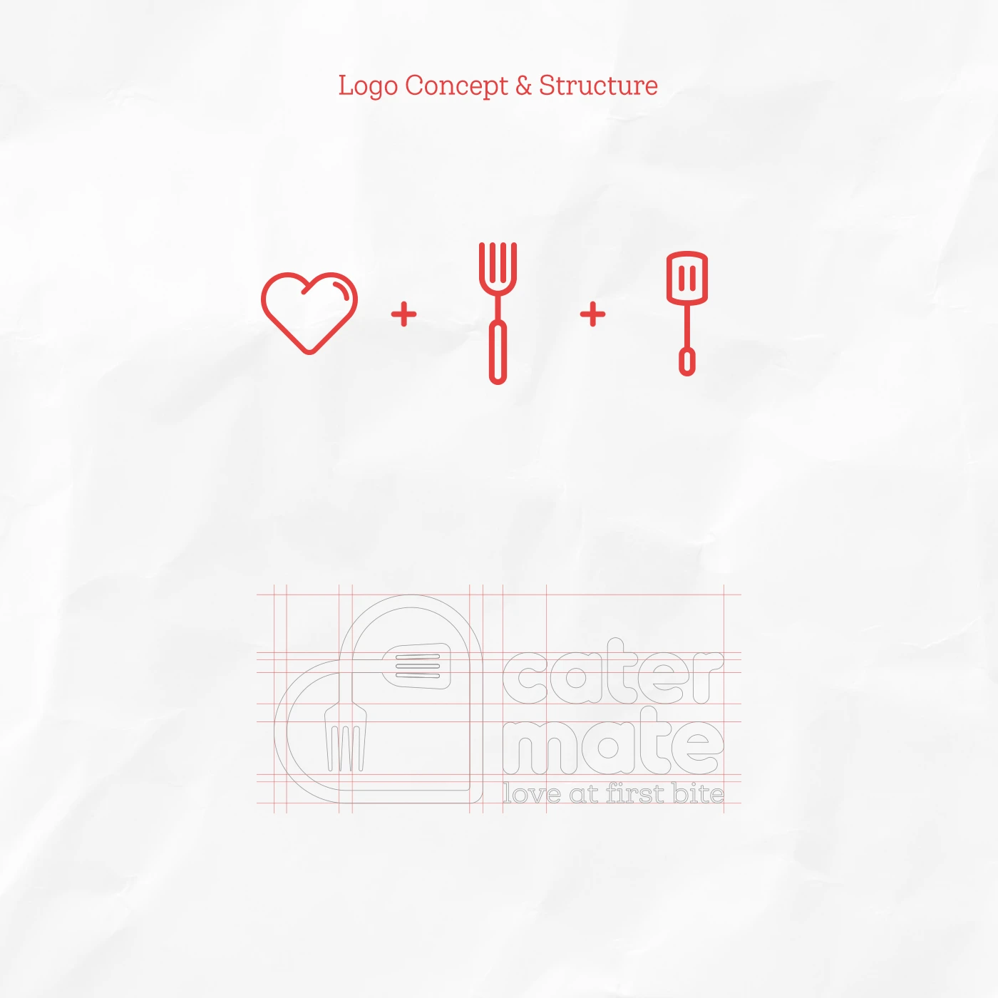
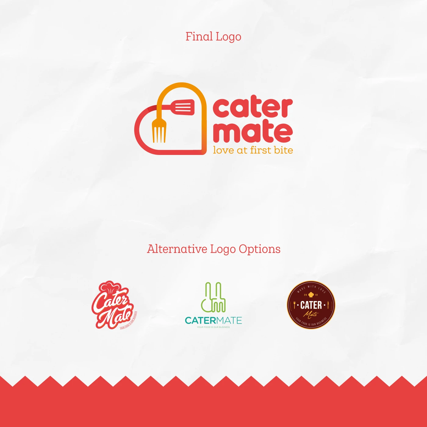
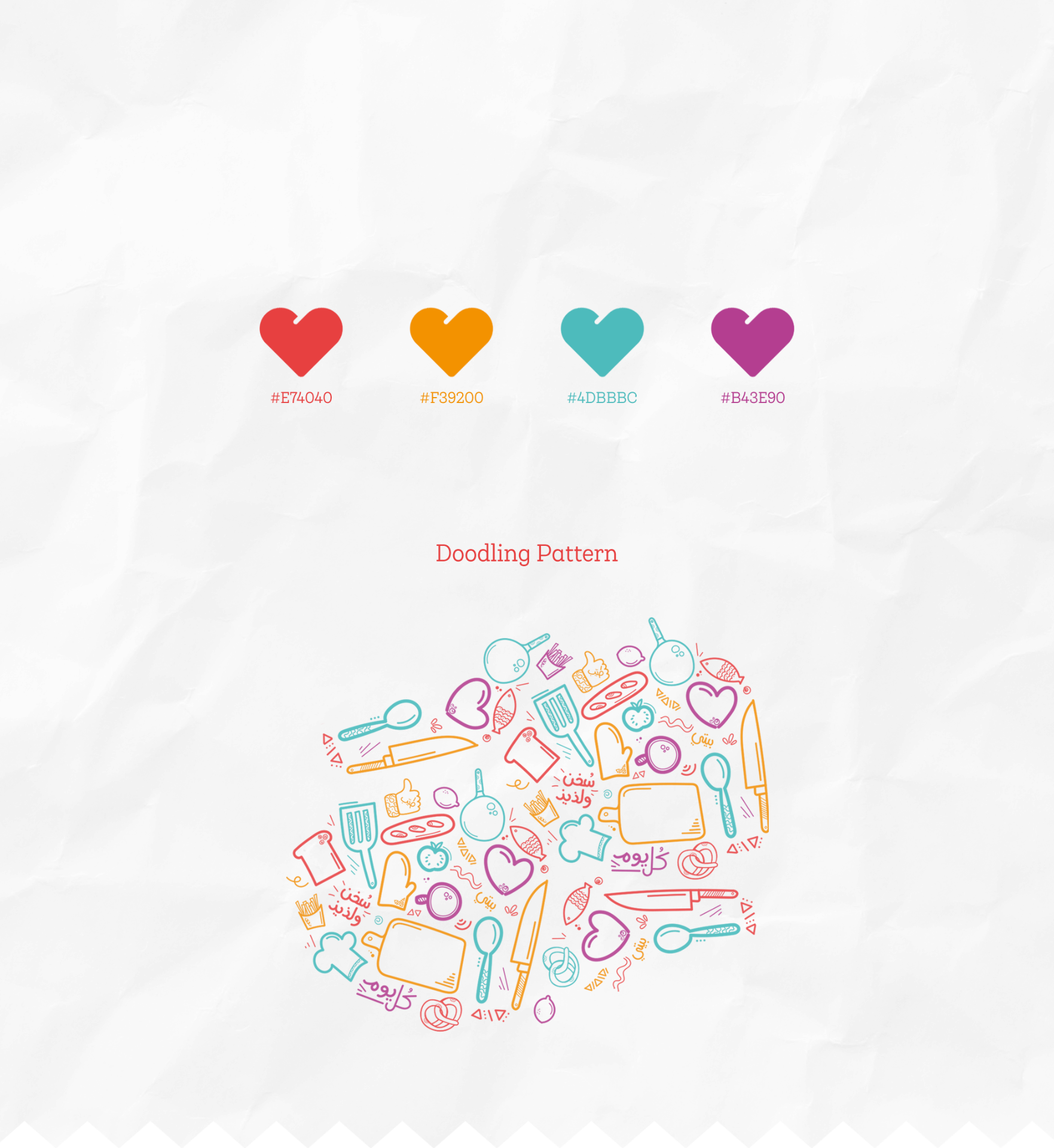
An identity that fuses heart, fork and spatula into one mark — paired with a doodle system, hot palette and packaging built for delivery-first life.
Logo Concept & Structure
The Result
A brand warm enough to feel like home, sharp enough to scale.
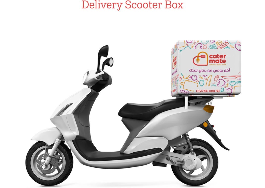
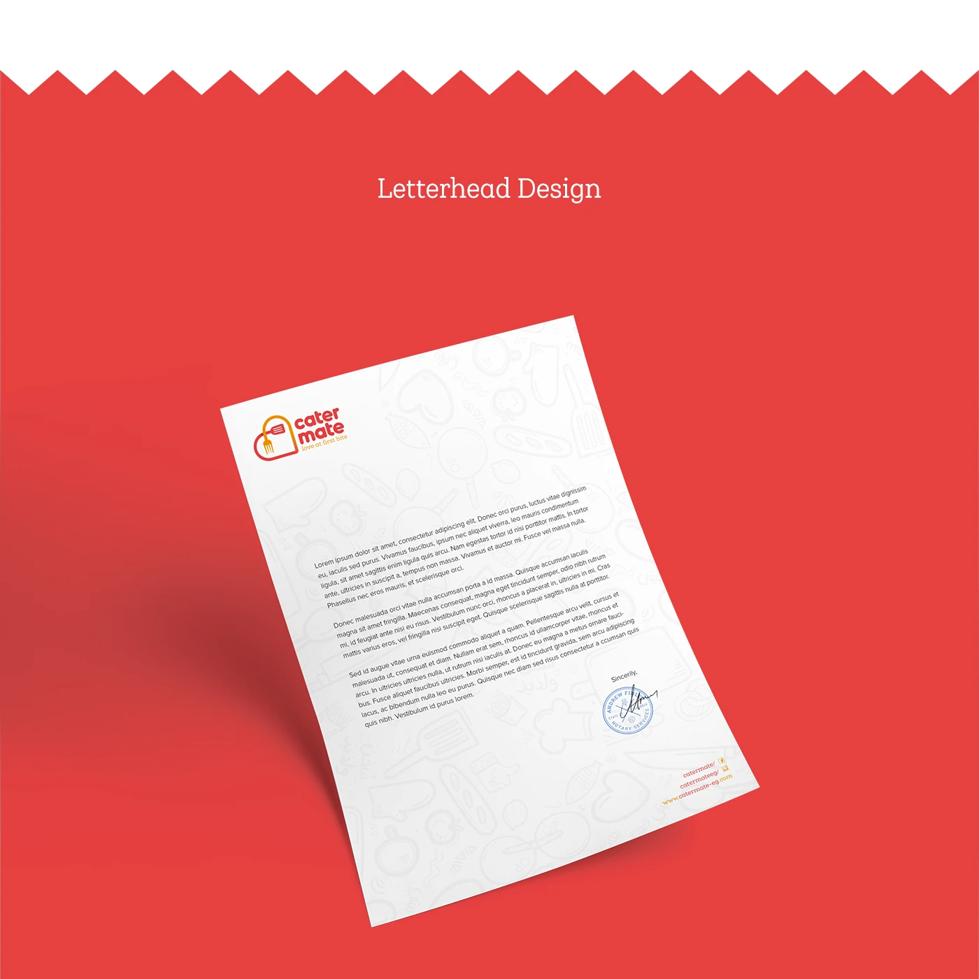
Sharper positioning, a system that holds up across cities, and a rollout — from packaging to scooter boxes to letterhead — operators can actually run. Clarity that drove franchise expansion.
Thank you.
Cater Mate · Branding · Packaging · Rollout