/ Case Study · F&B · Branding
Who Are They?
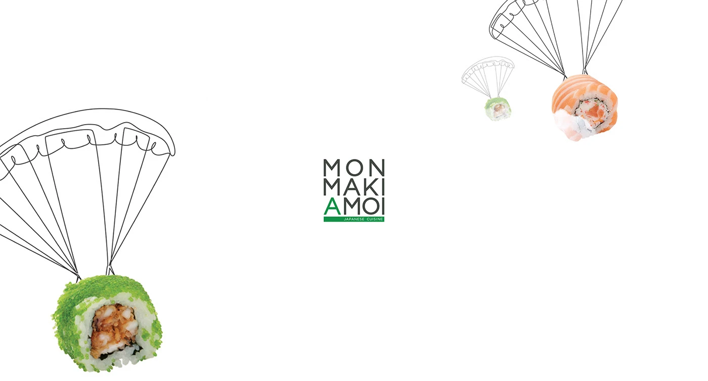
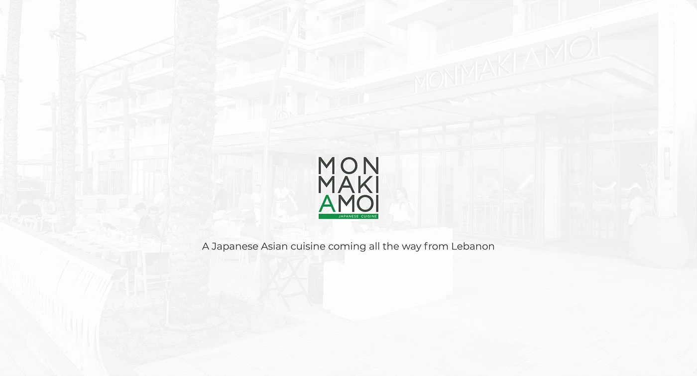
Mon Maki A Moi is a Japanese cuisine concept serving fresh, hand-rolled sushi — light, vibrant and made with care for guests who want quality without the formality.
The Challenge
Stand apart in a sushi category dominated by either ultra-traditional Japanese aesthetics or generic modern fusion — and build an identity that feels playful, premium and distinctly its own.
The Solution
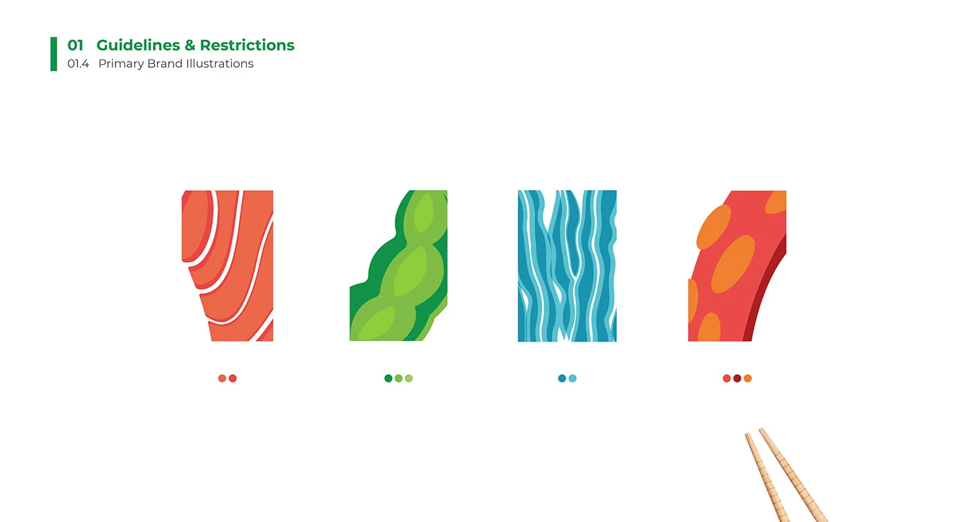
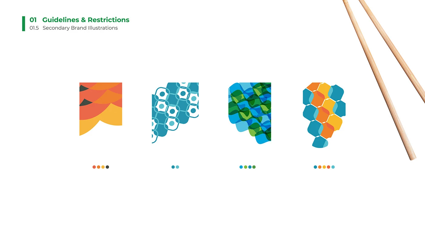
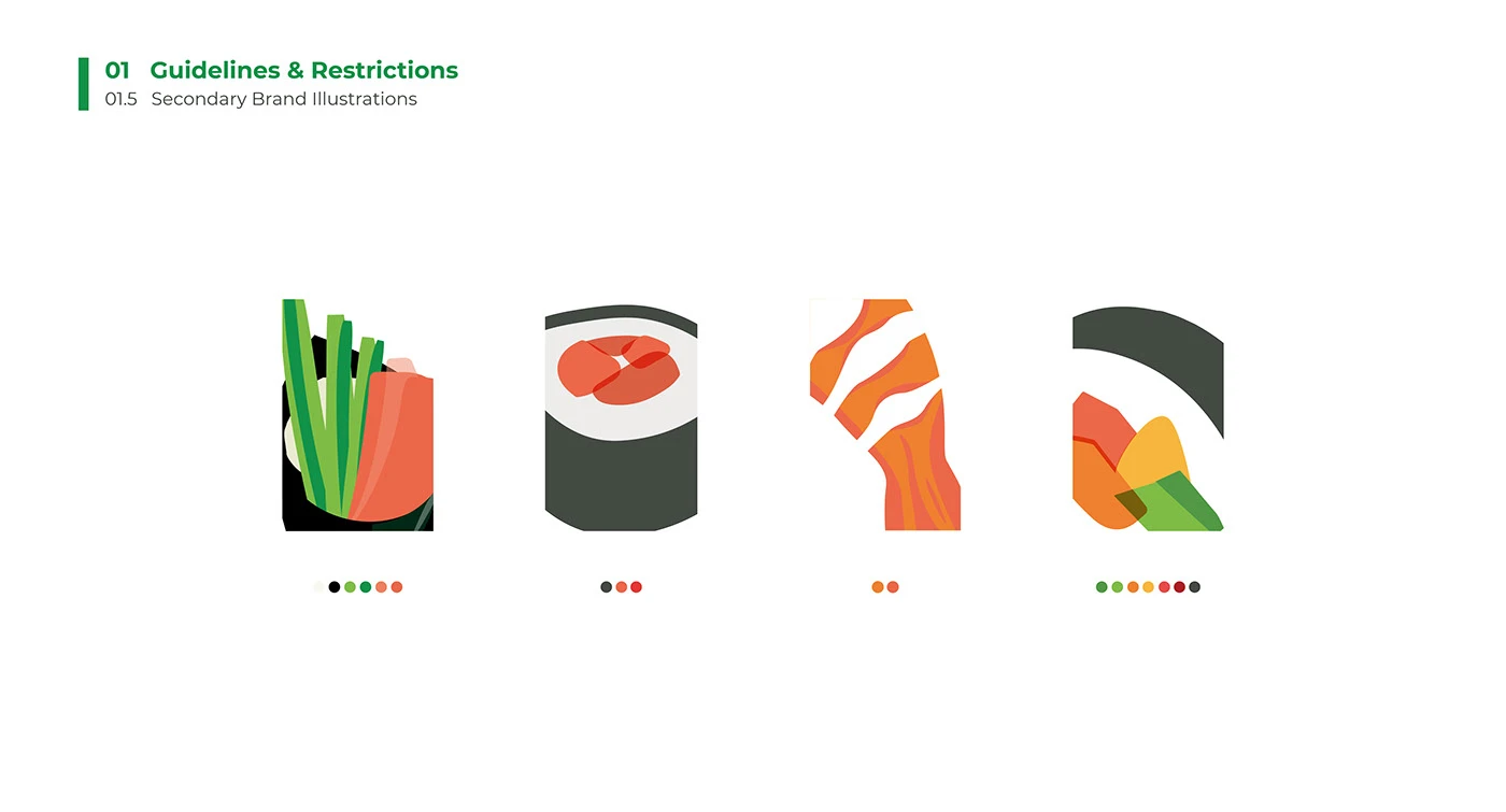
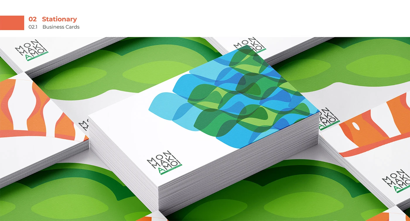
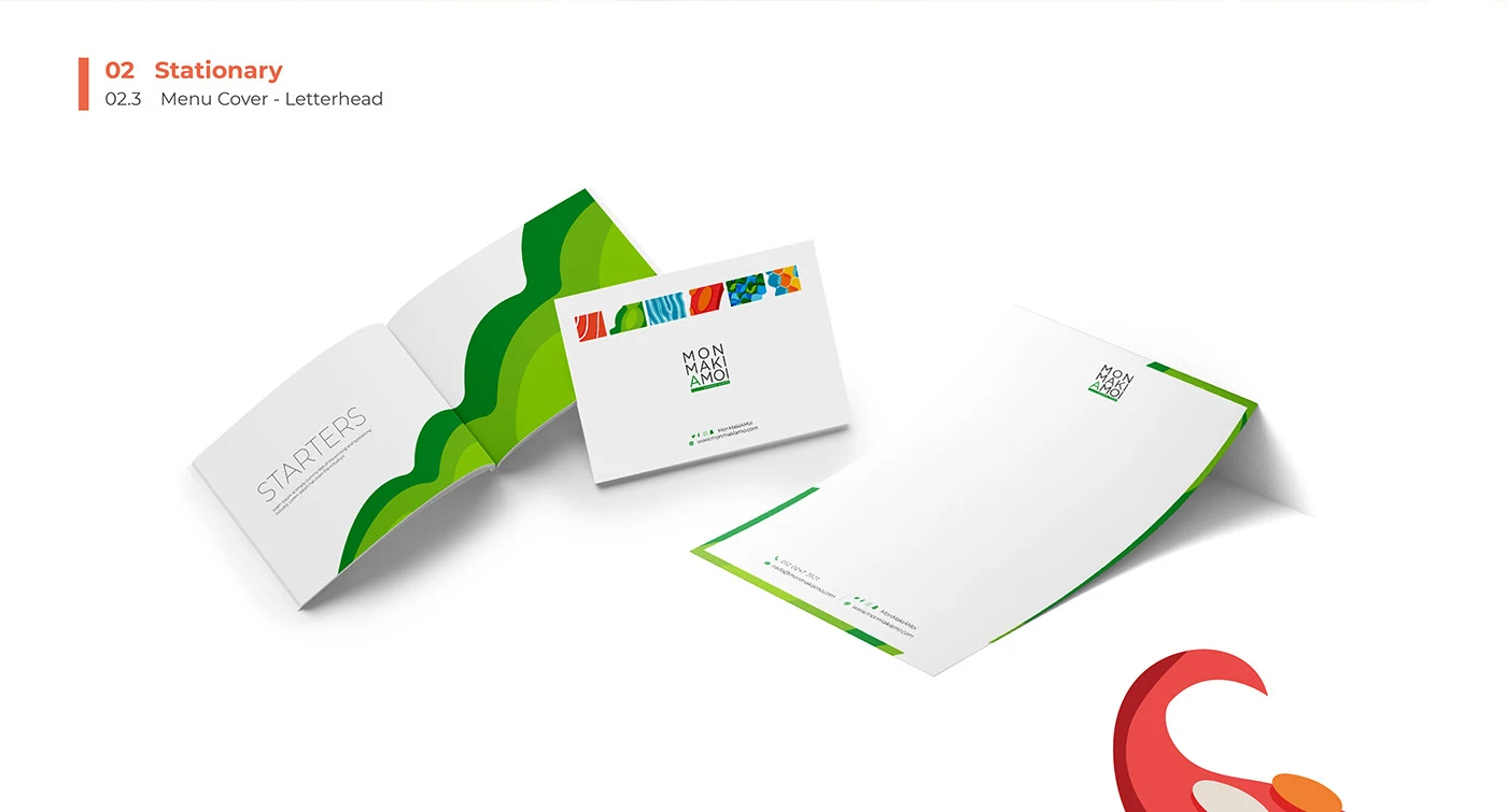
A bold typographic wordmark paired with watercolor illustrations, a parachute-and-maki signature visual, and a modular packaging, stationery, fleet and uniform system that scales across every brand touchpoint.
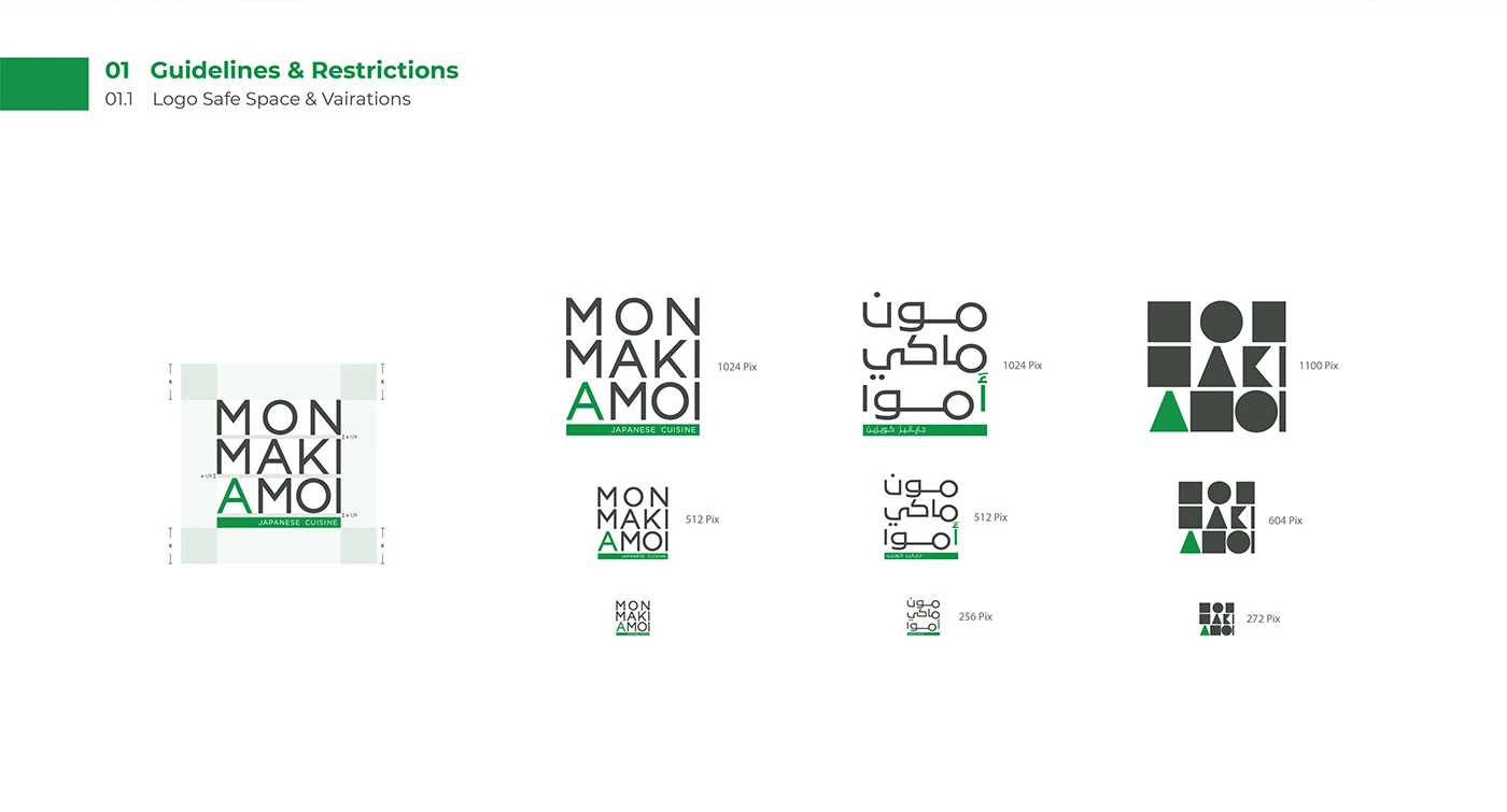
Logo & Guidelines
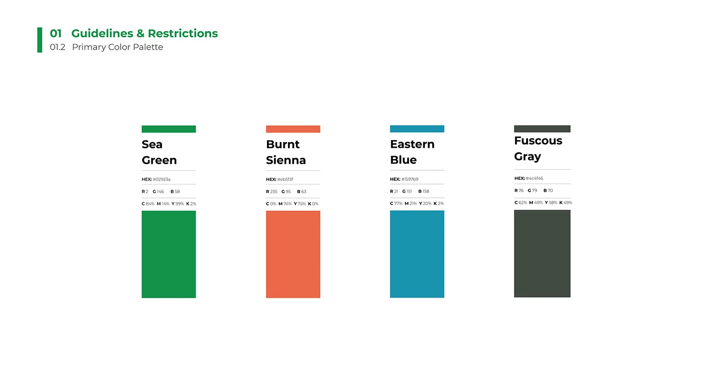
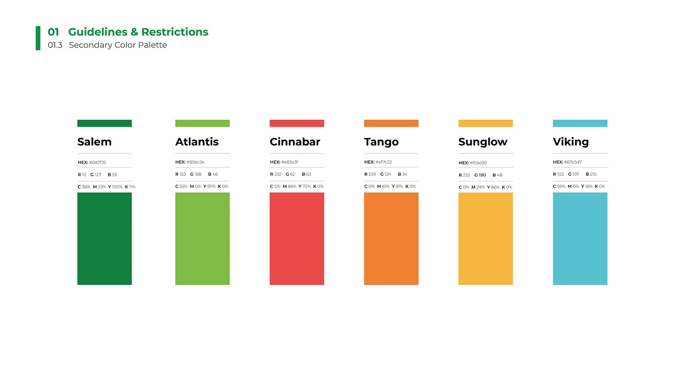
Color Palette
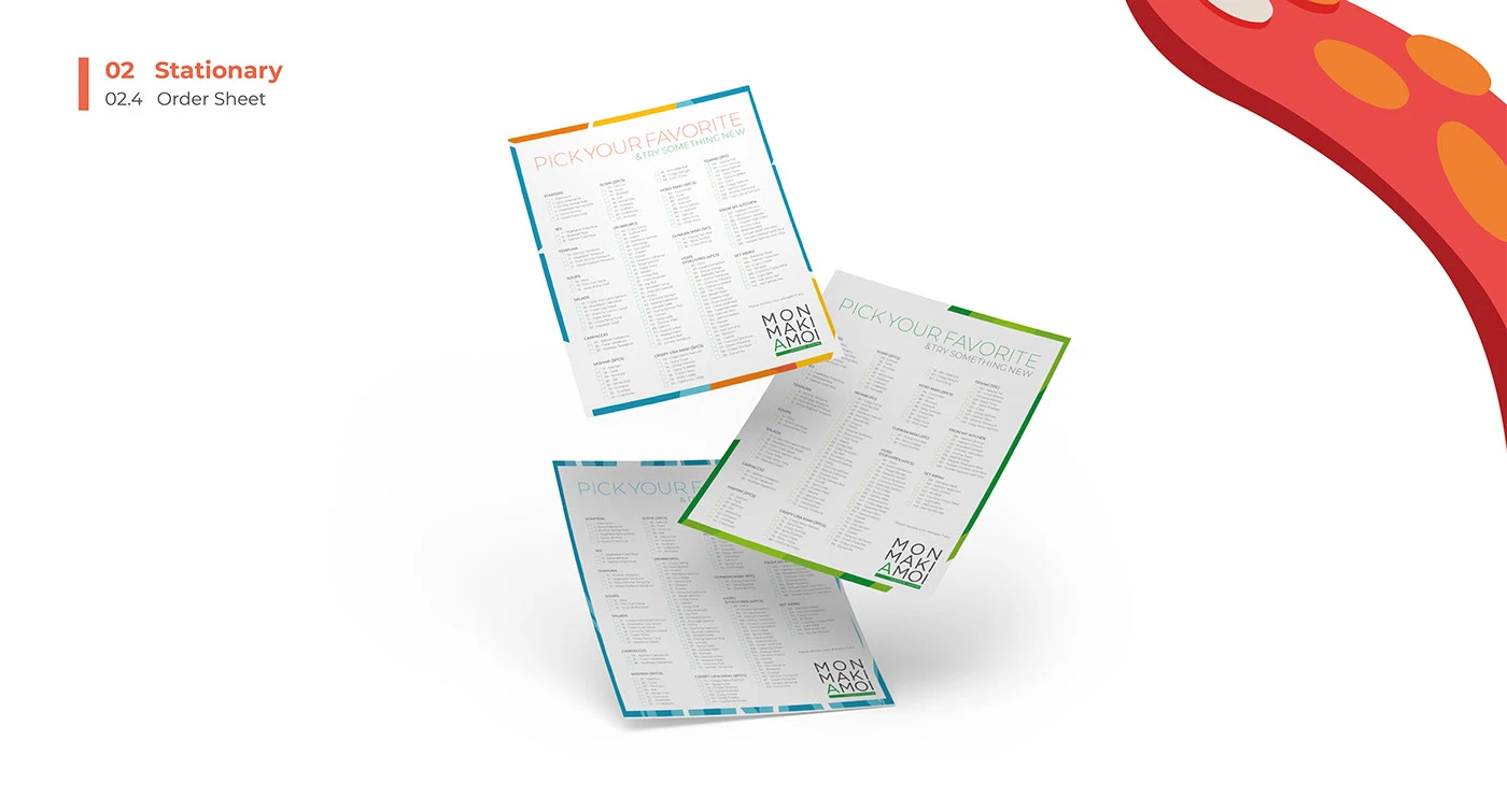
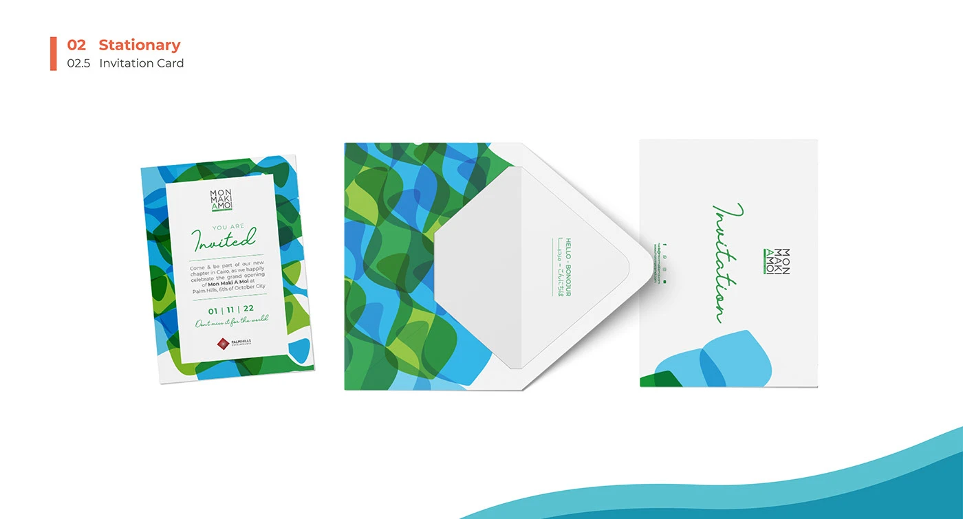
Stationery
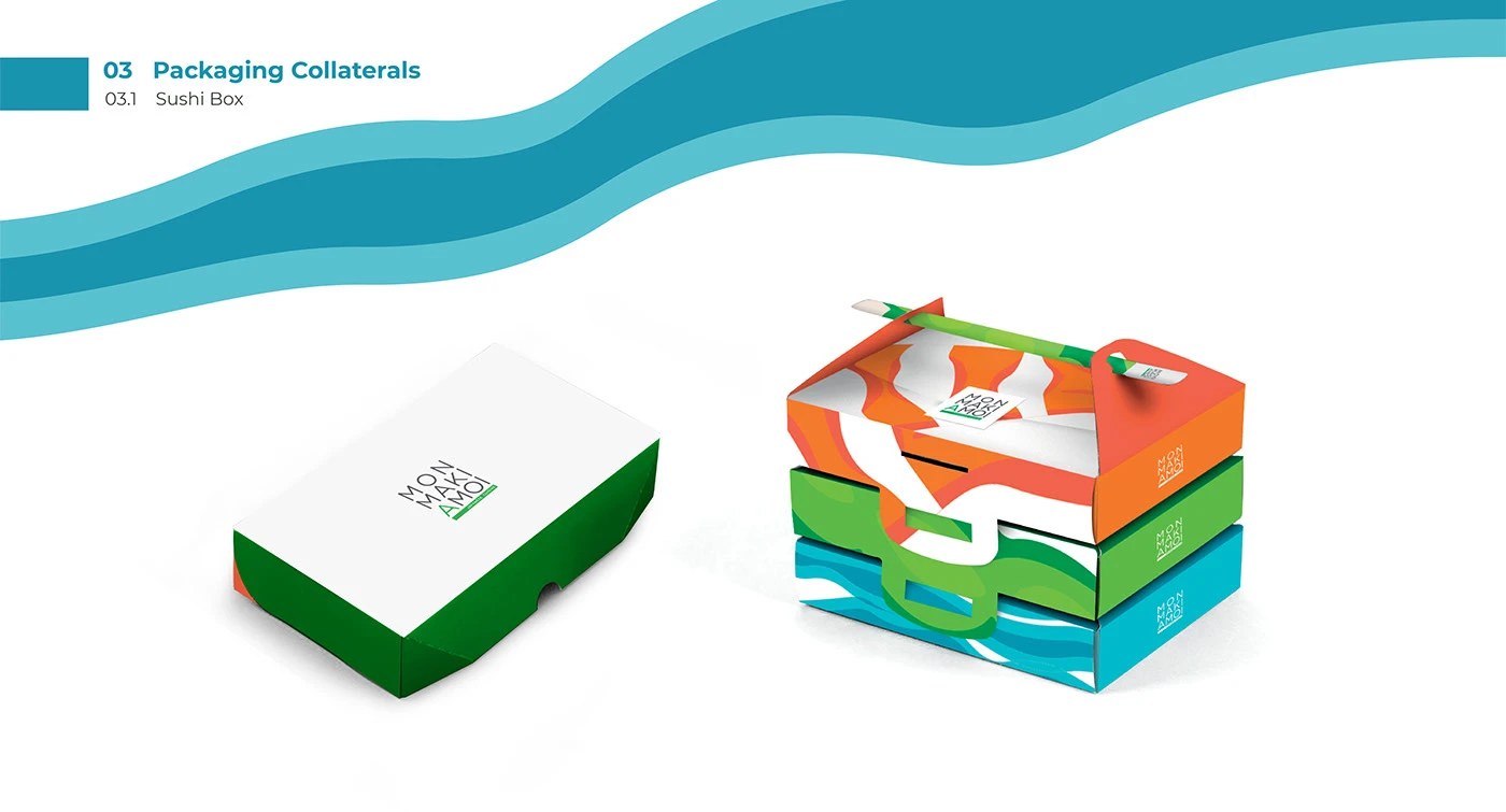
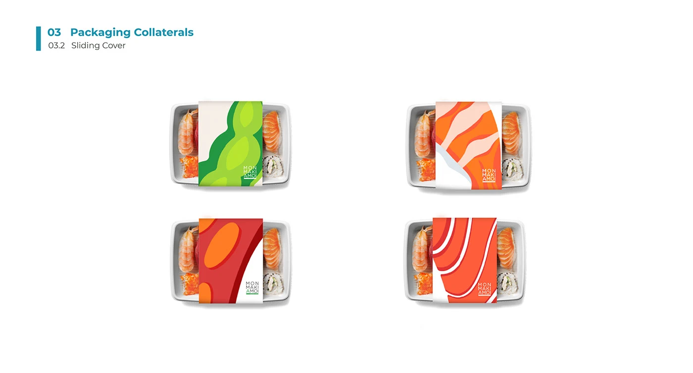
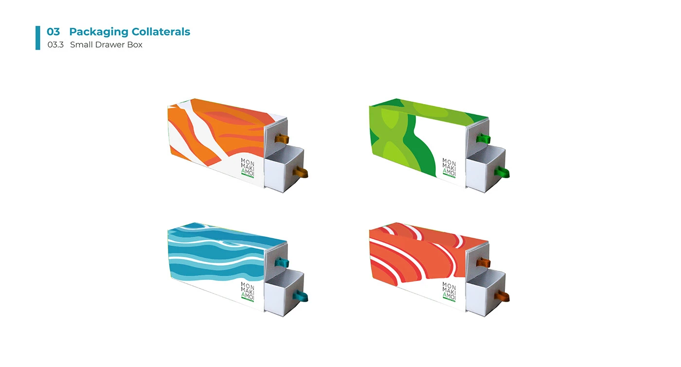
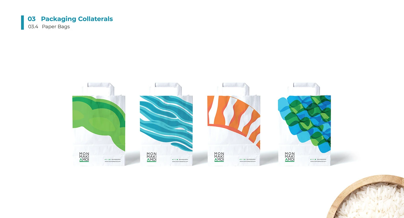
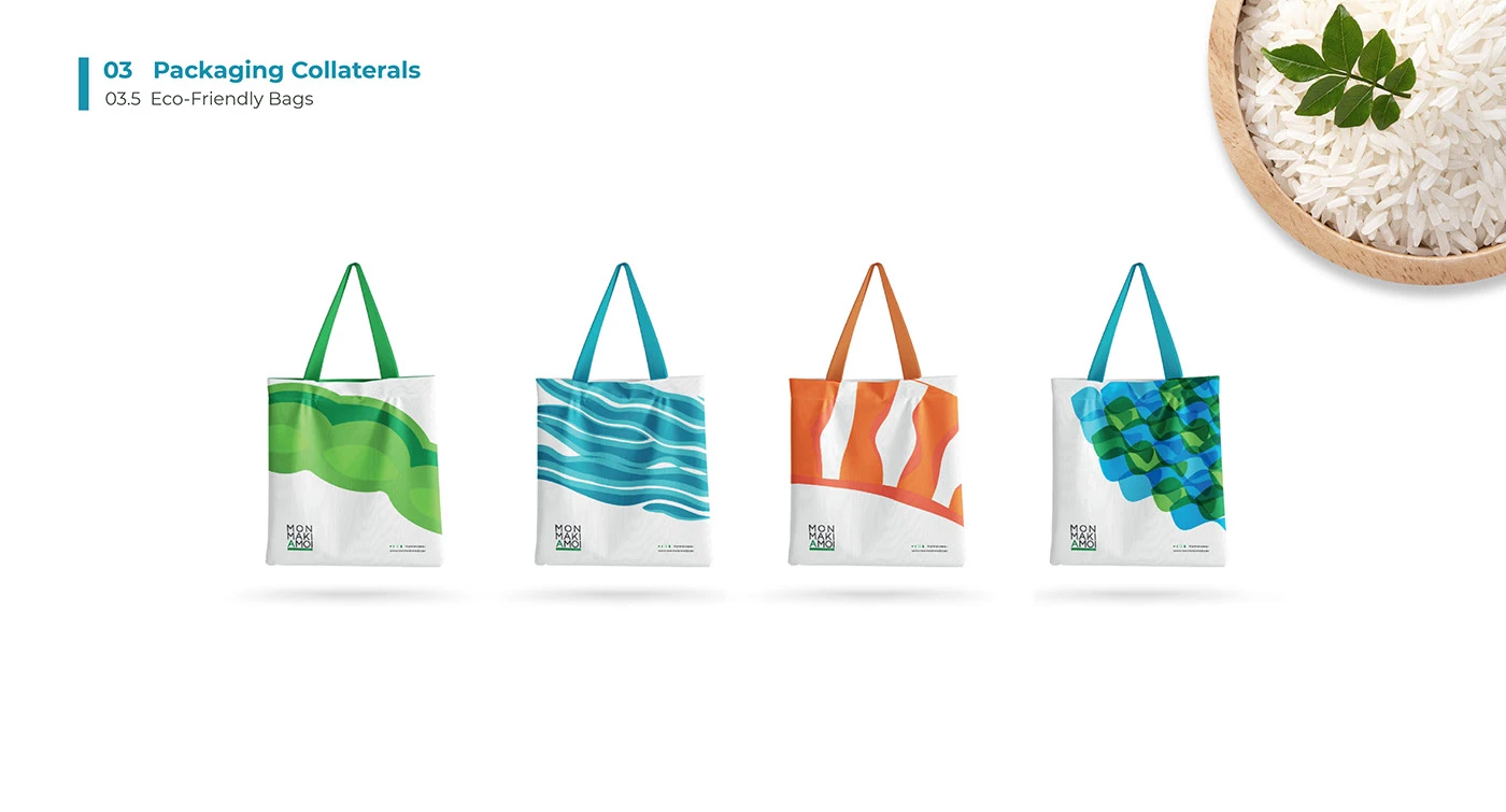
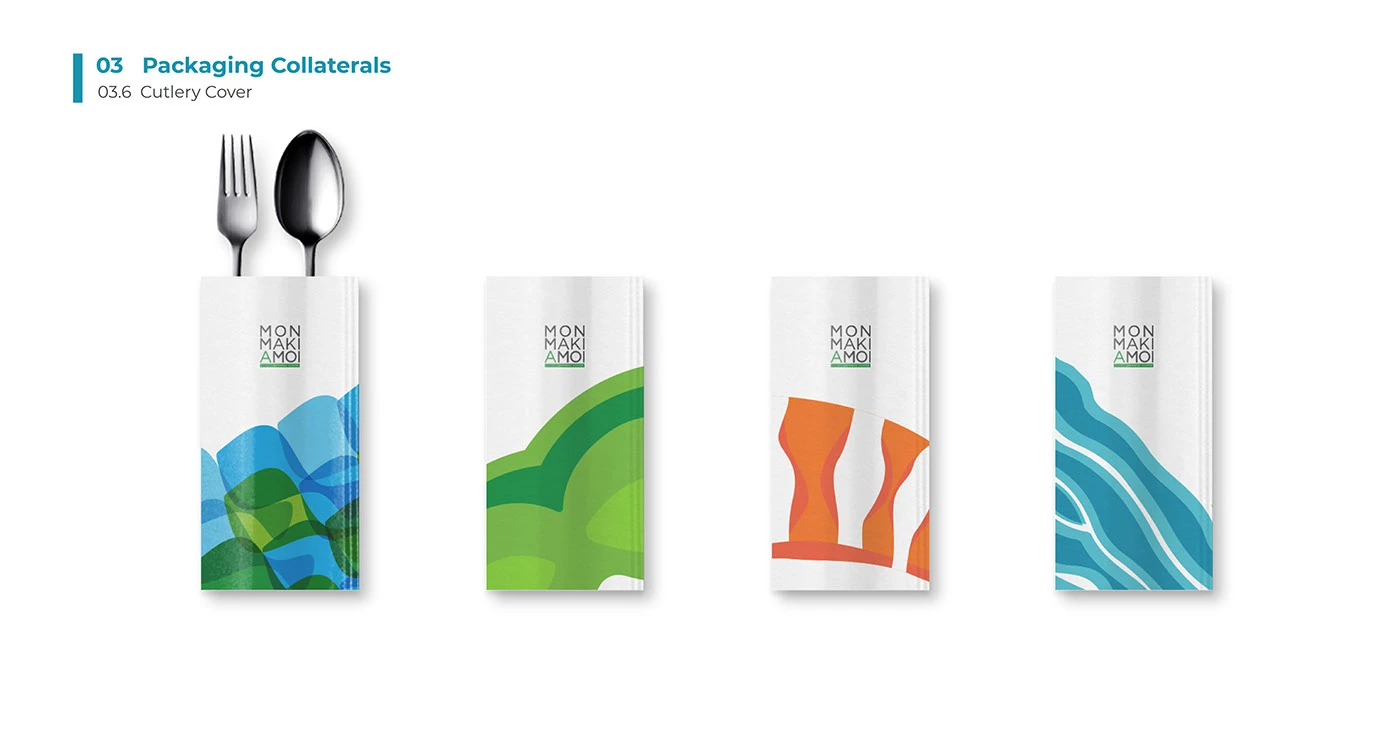
Packaging
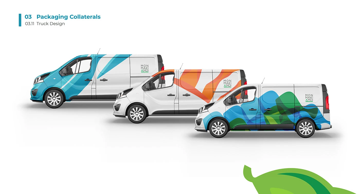
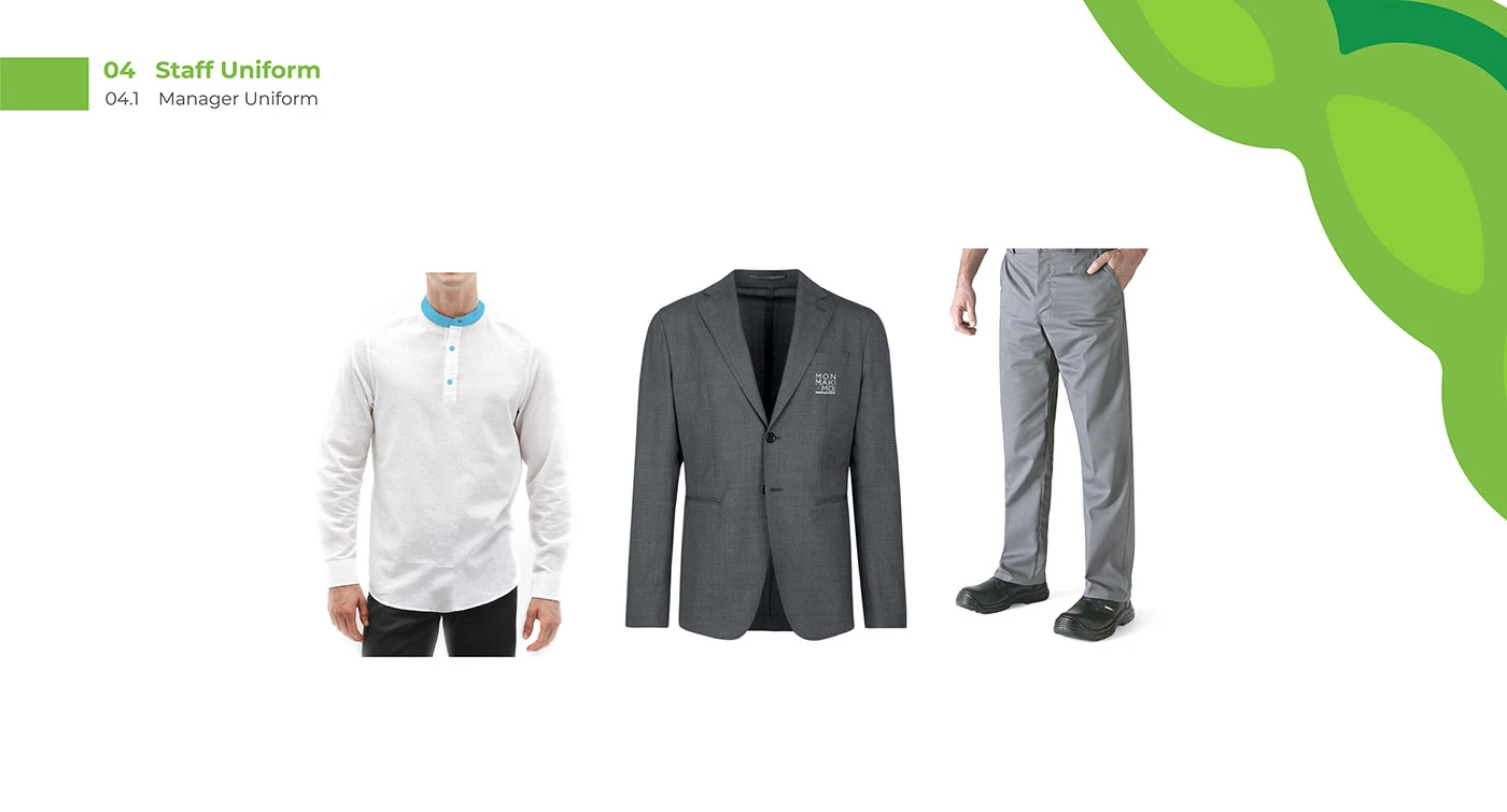
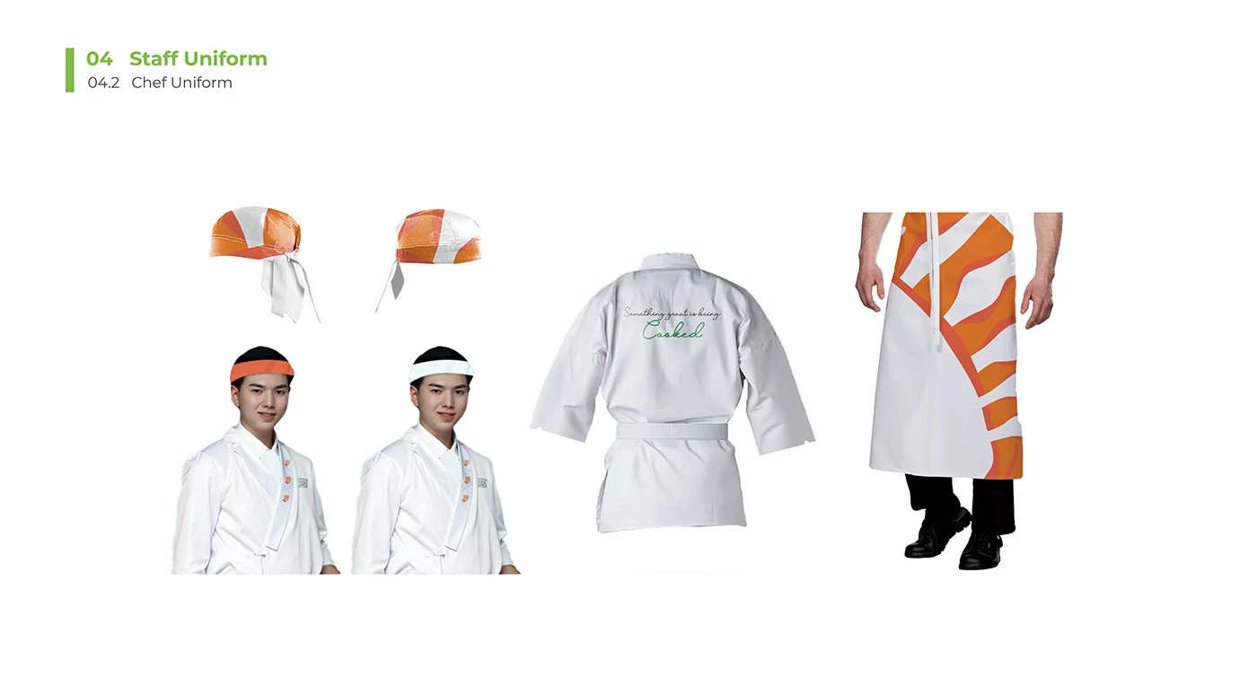
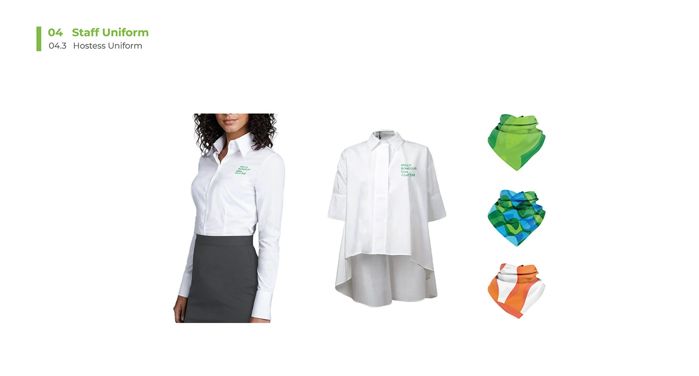
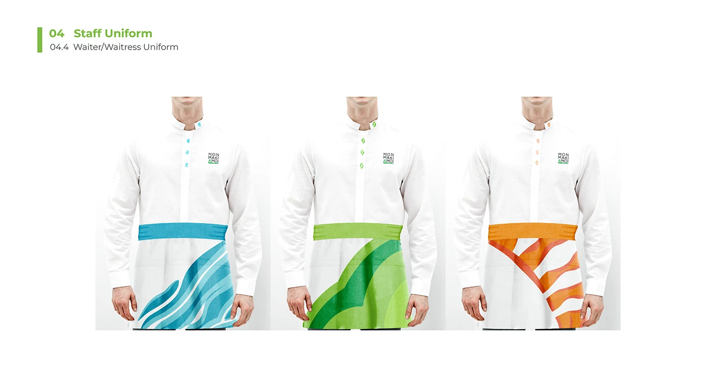
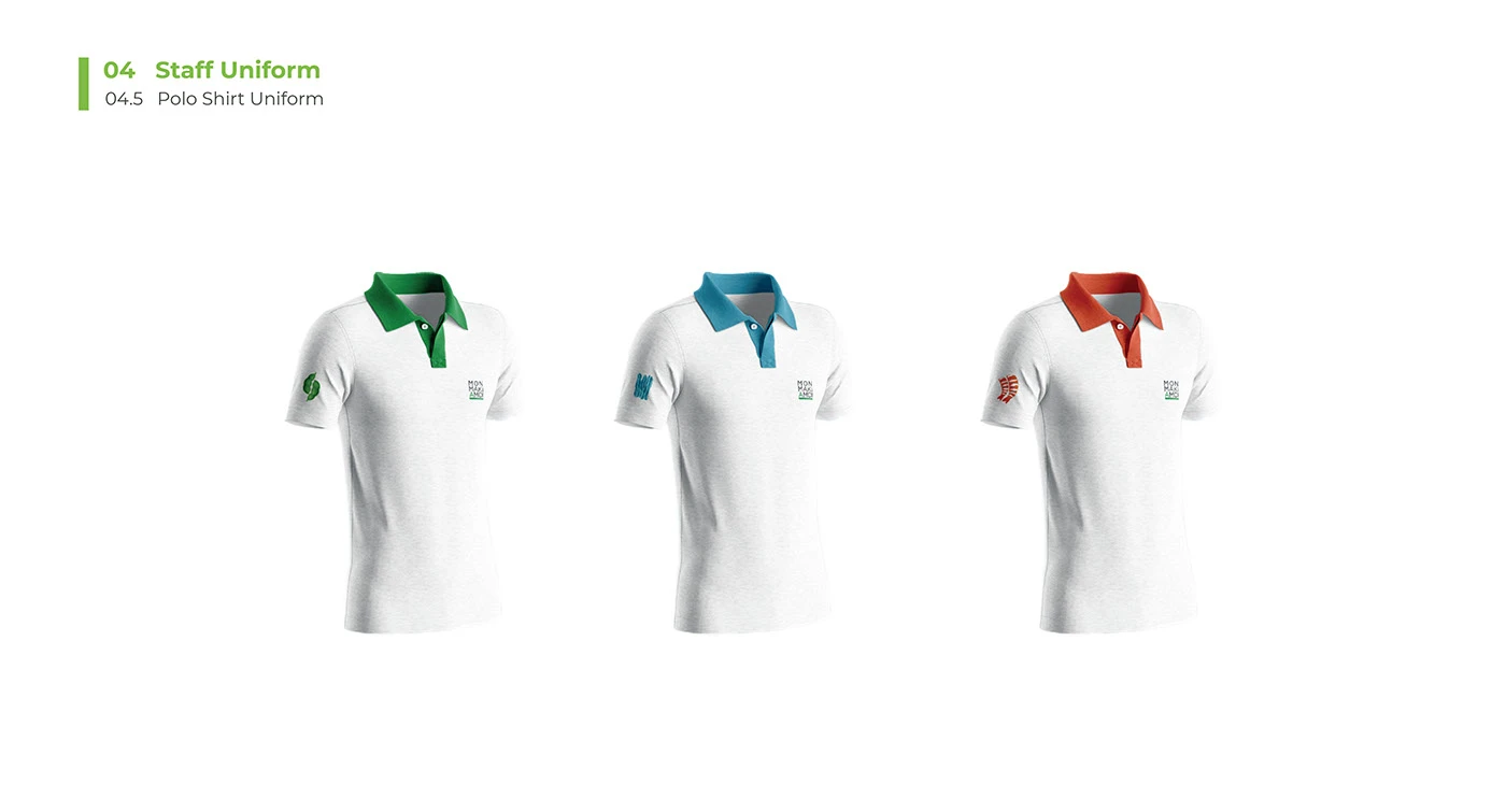
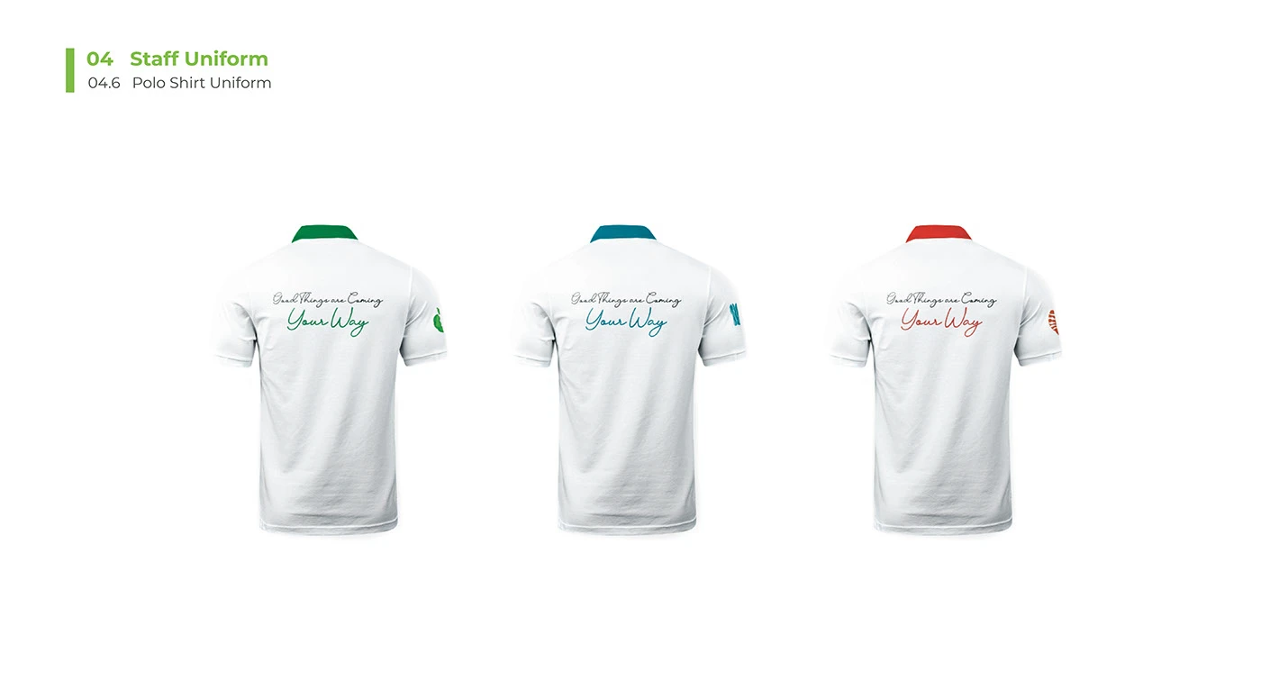
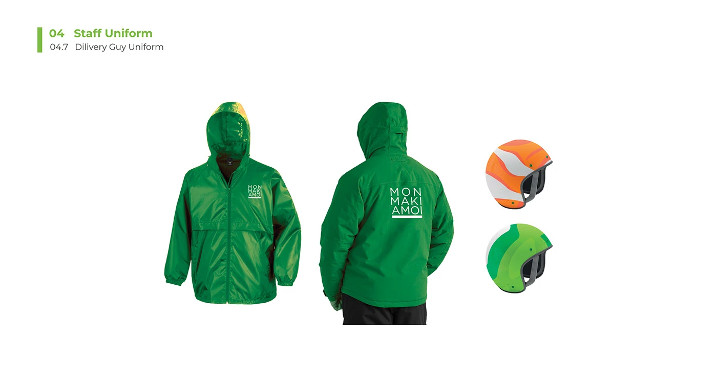
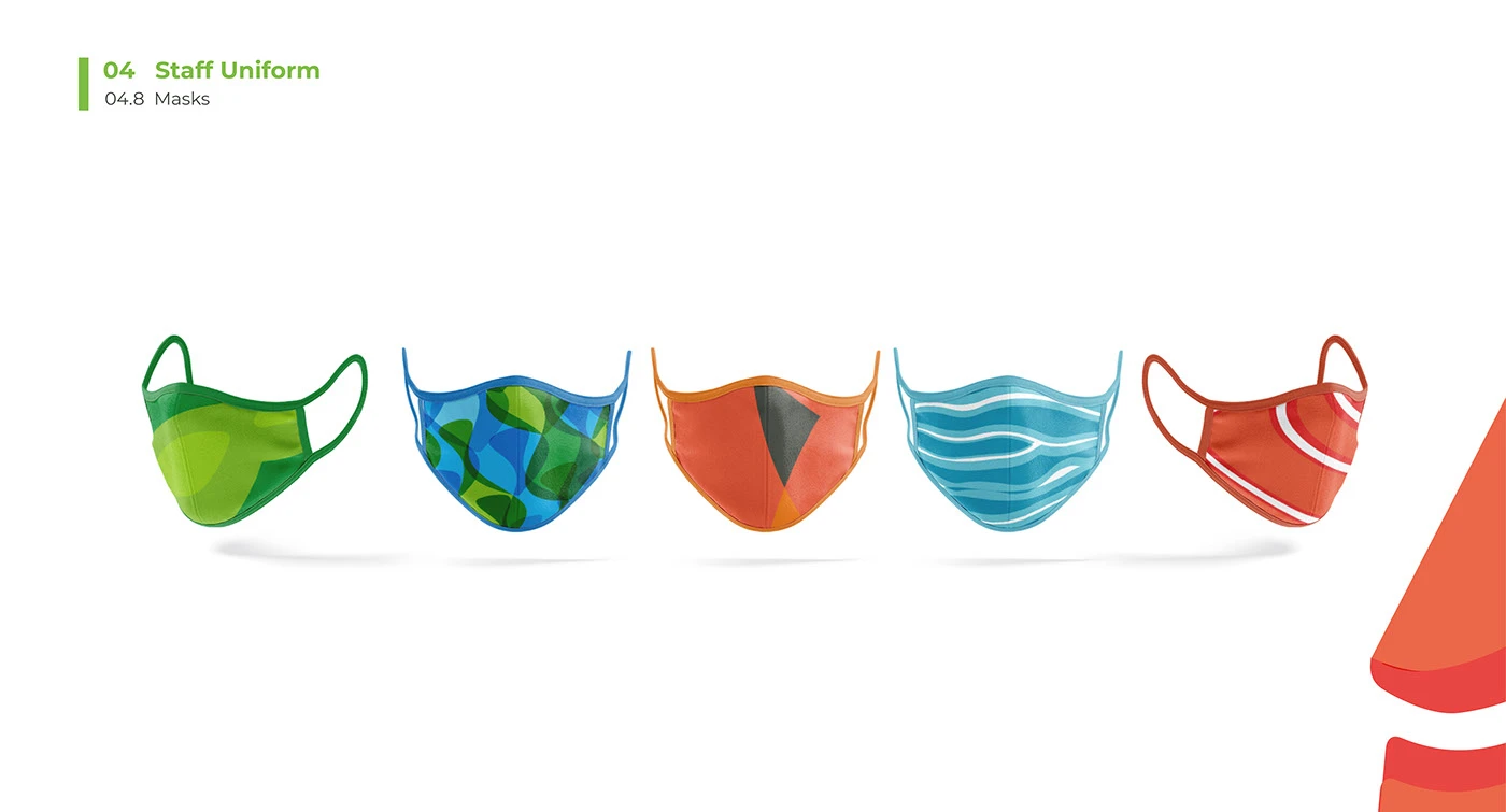
Fleet & Uniforms
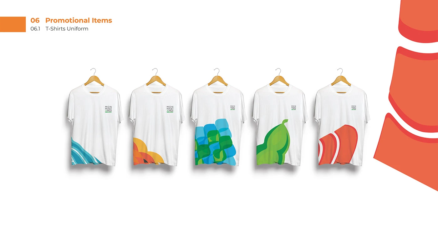
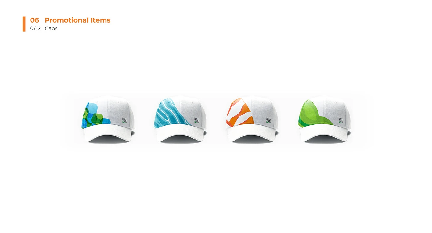
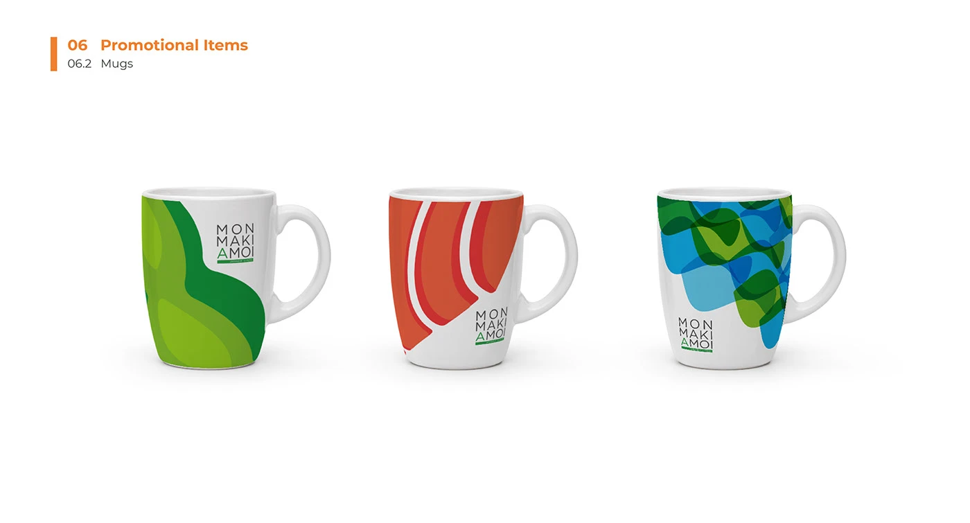
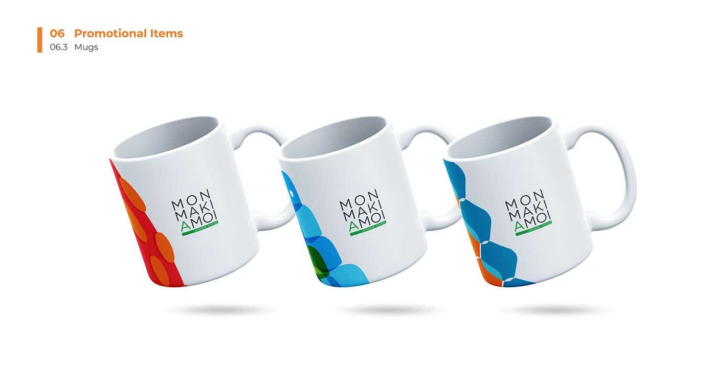
Promotional
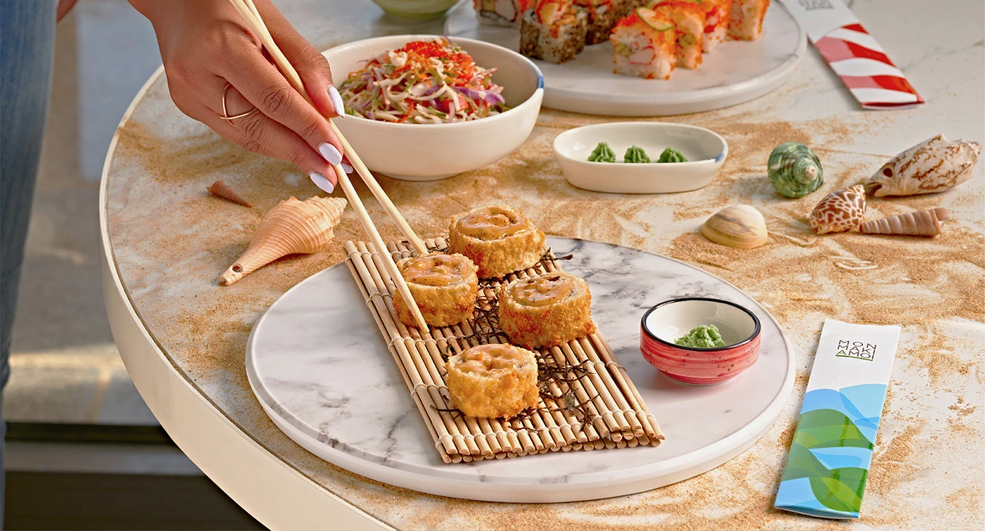
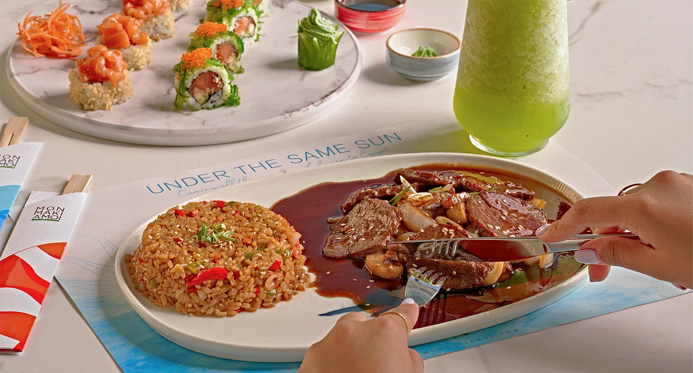
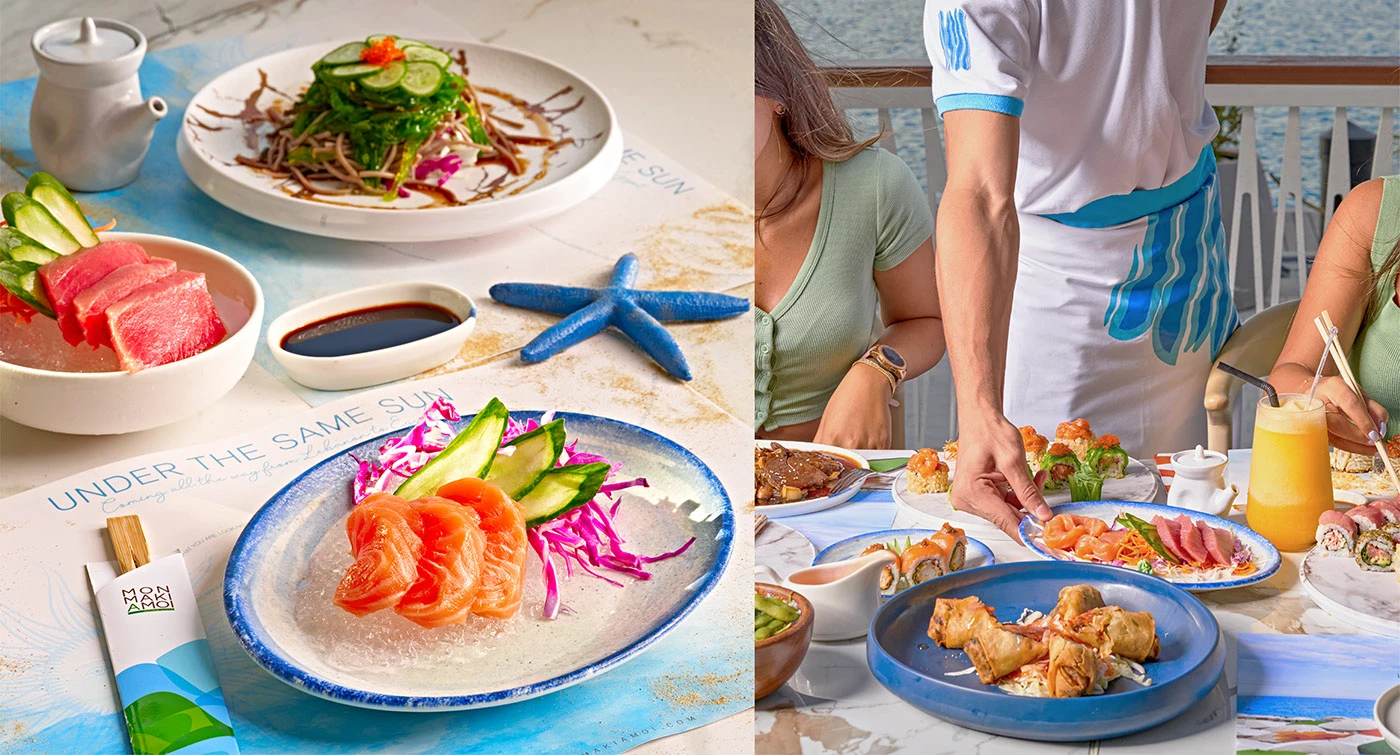
In Use
Thank You
The Result
A sushi brand that feels as fresh as the food it serves.
From wordmark to delivery fleet, every touchpoint of Mon Maki A Moi pulls in the same direction — a playful, premium identity built to scale across packaging, retail, staff and digital.